Reference Dataset for Model Validation
STORM Synthetic Tropical Cyclone Track Catalog (4TU Data Repository)
This page presents results from the STORM stochastic tropical cyclone catalog, a commonly used open benchmark dataset for synthetic tropical cyclone tracks.
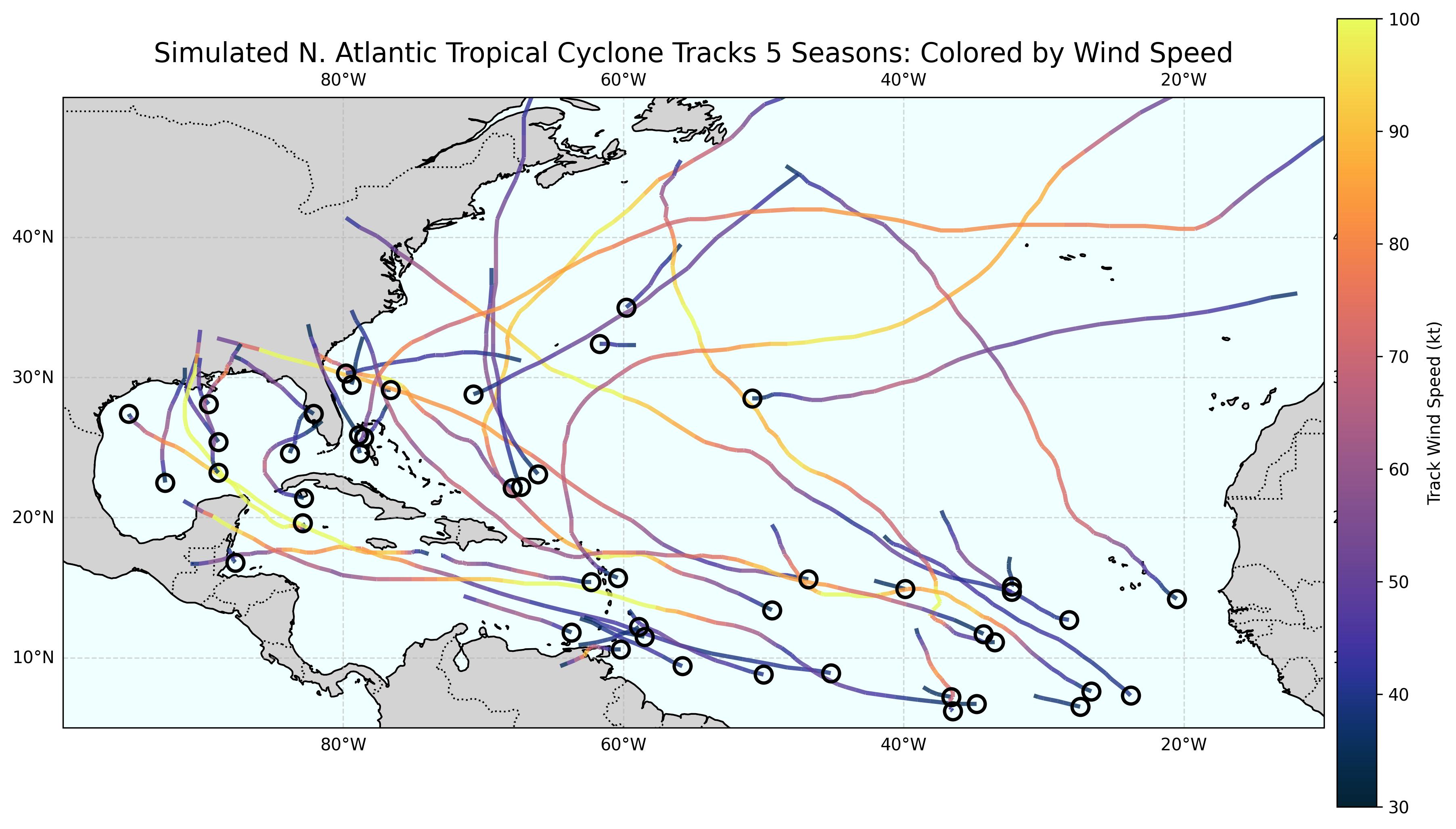
These maps display the first five simulated tropical cyclone seasons of STORM data. Each track begins at an open circle (genesis point) and is represented by a line colored according to wind speed.


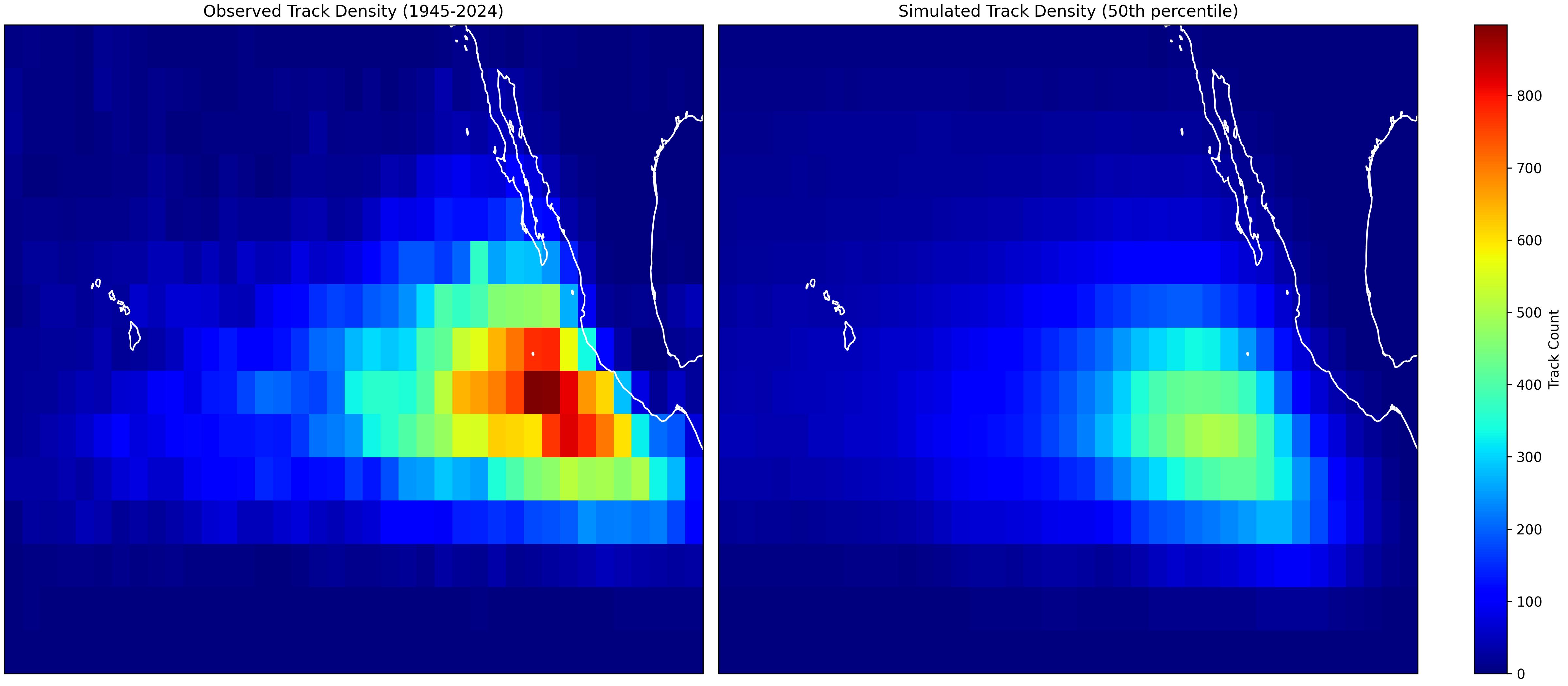
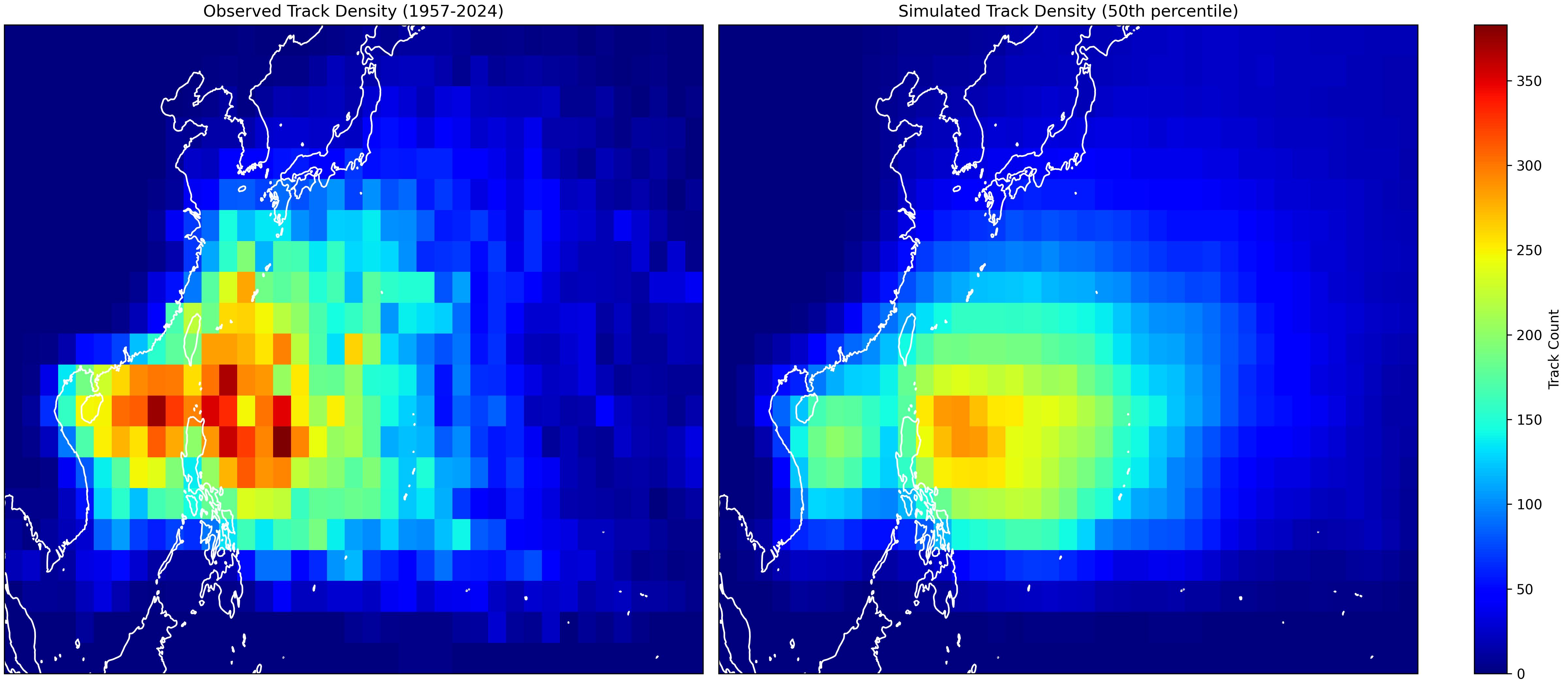
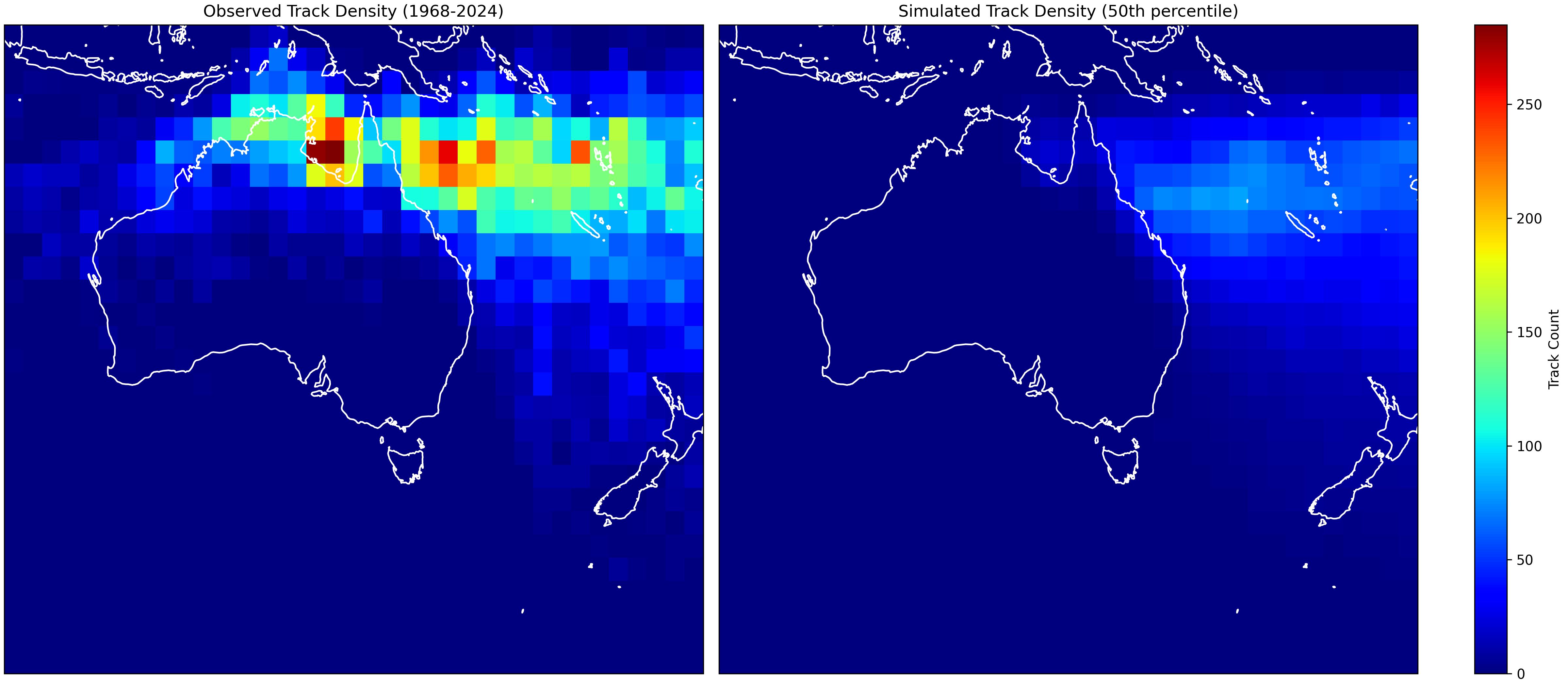
Observed track density (left) and simulated STORM track density (right). Simulated is the 50th percentile (median) of 100 random draws of the same number of seasons as the observed. The sample median is a strong choice because it is not affected by extreme values or outliers, making it a robust measure of central tendency even when the underlying distribution is skewed or has extreme values.

IBTrACKS NA data in csv for Python code


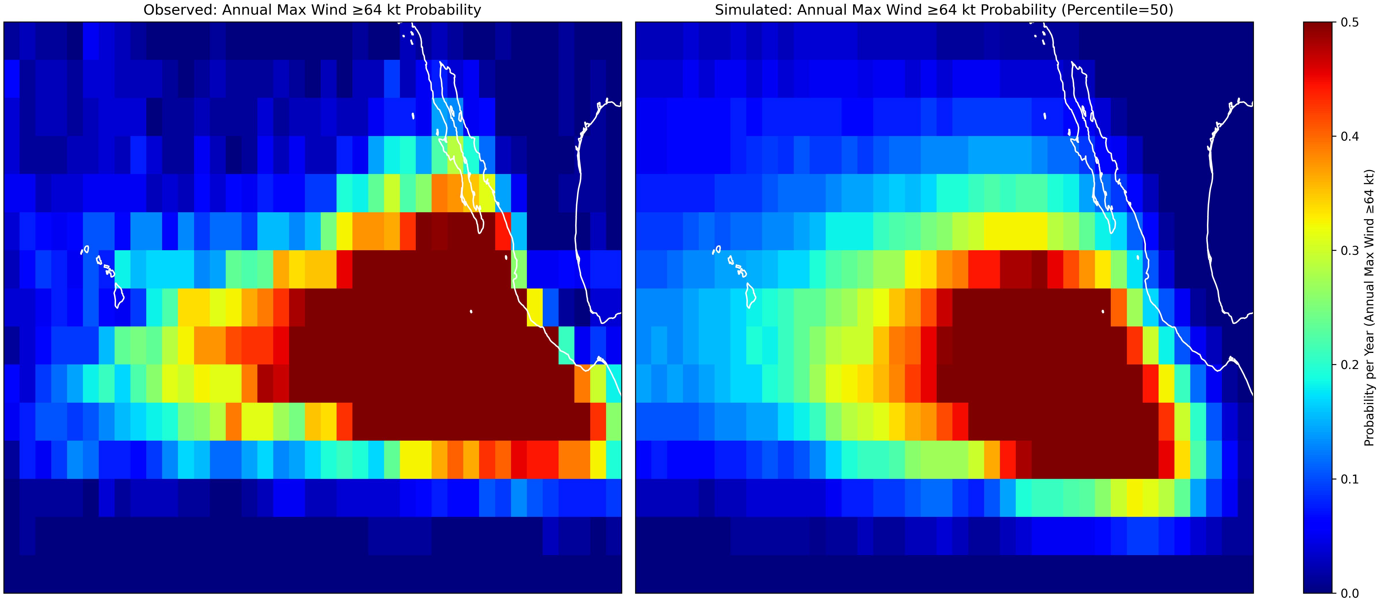
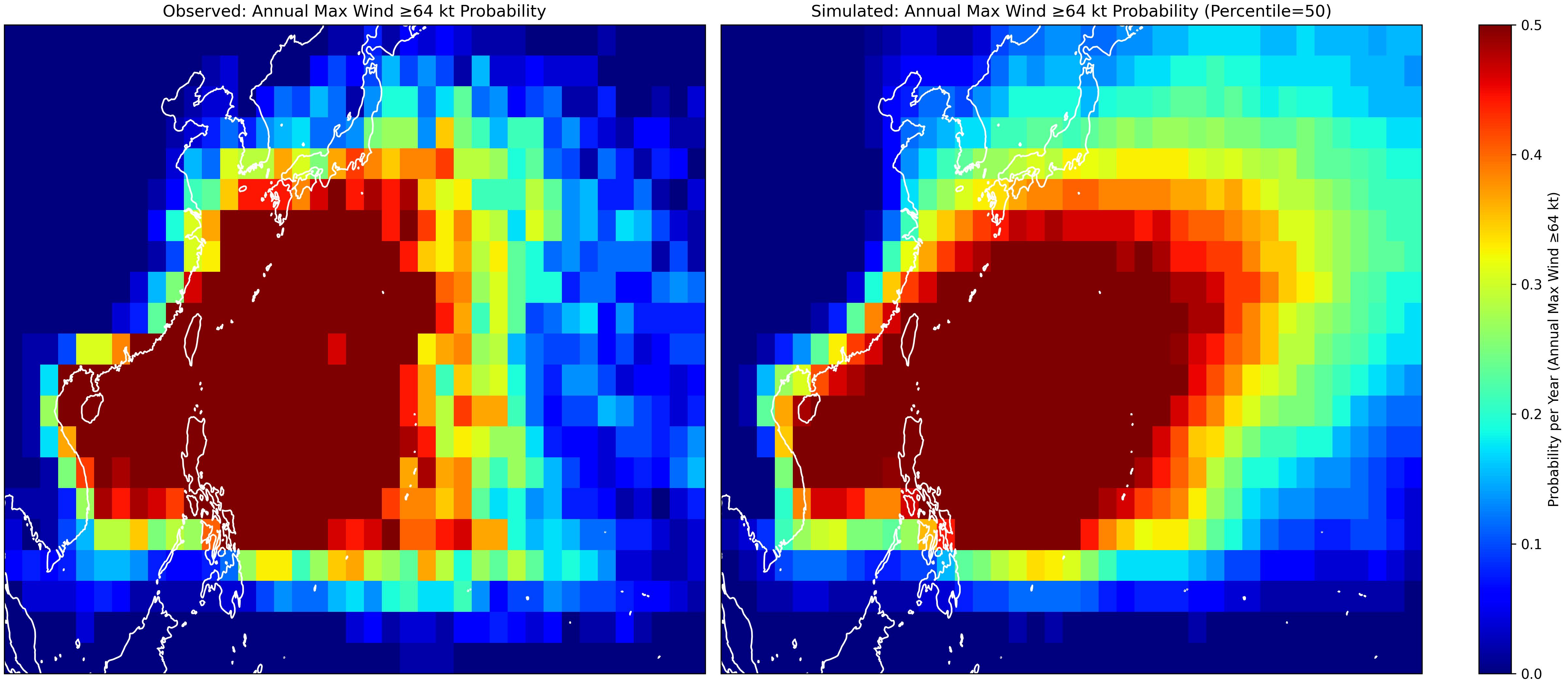
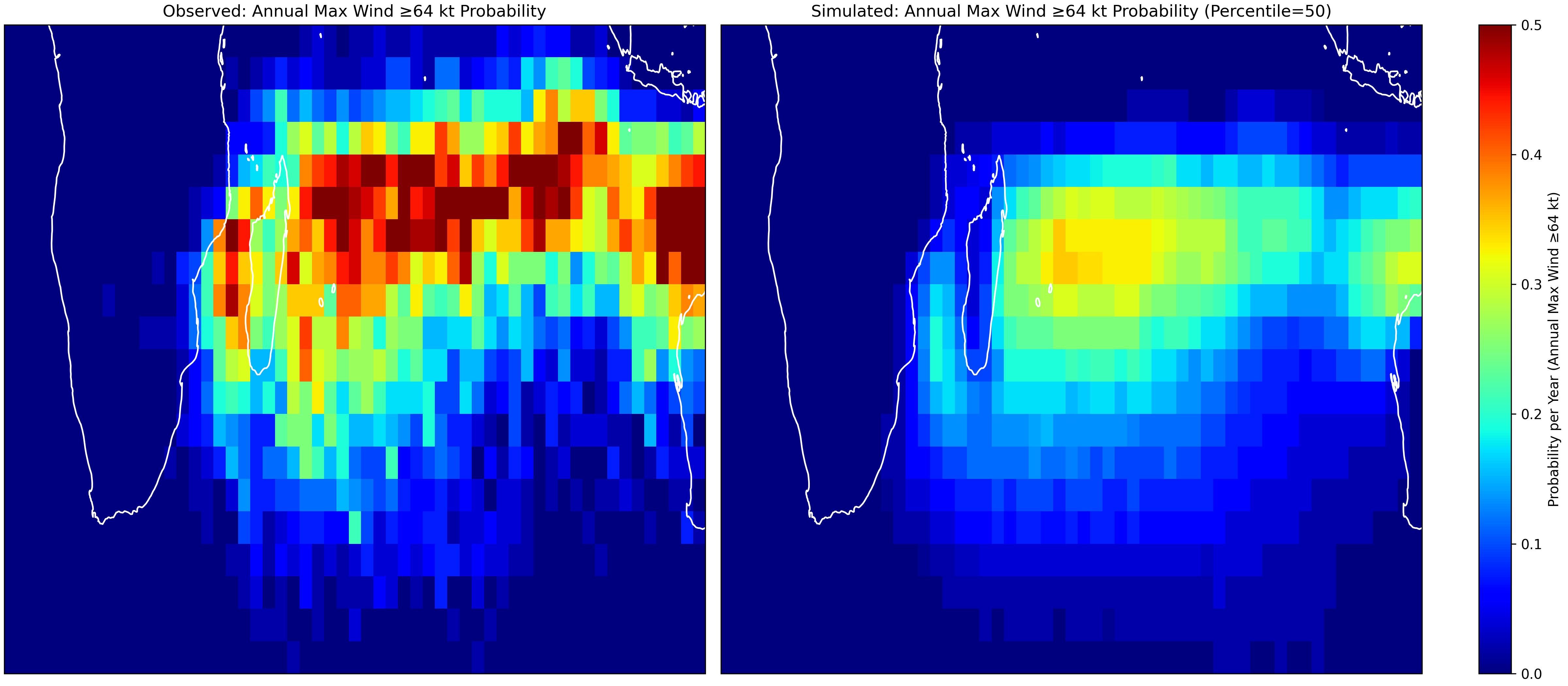
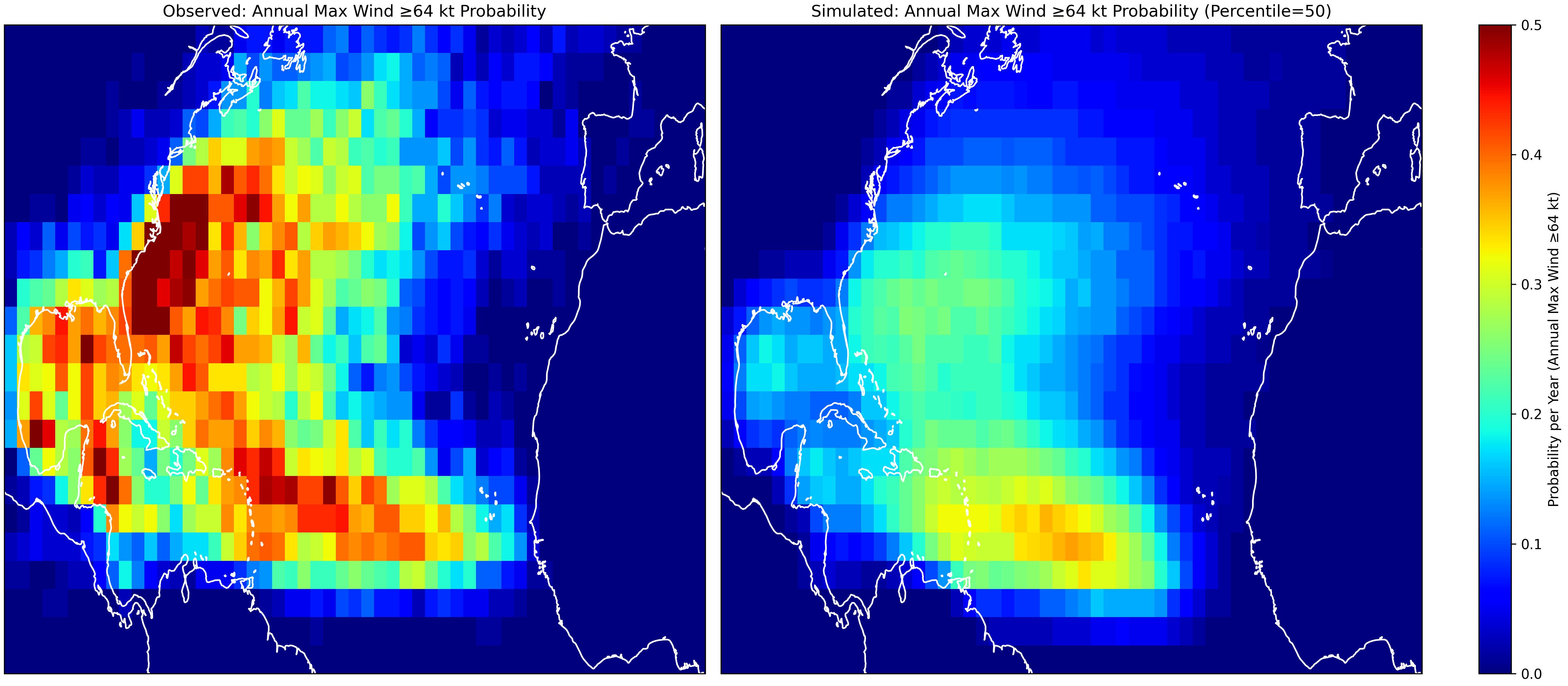
Observed Annual Maximum Wind >=64 knots Probability (left) and STORM simulated (right). Simulated is the 50th percentile (median) of 100 random draws of the same number of seasons as the observed.
IBTrACKS NA data in csv for Python code